Jacht Recruitment 2026
*
Jacht Recruitment 2026 *
Jacht??
You mean yacht, right?
Nope! Jacht is a student-run ad agency at the University of Nebraska–Lincoln. “Jacht” is a Dutch term meaning onward, and that mindset fuels the agency’s commitment to moving clients forward. At Jacht, we do real work for real clients... and everything is entirely student-led.
As Art Director, I lead the creative direction for recruitment each semester. The turnaround was quick. As soon as I was named to the role, I had to hit the ground running with ideas to get students excited to apply and join our team.
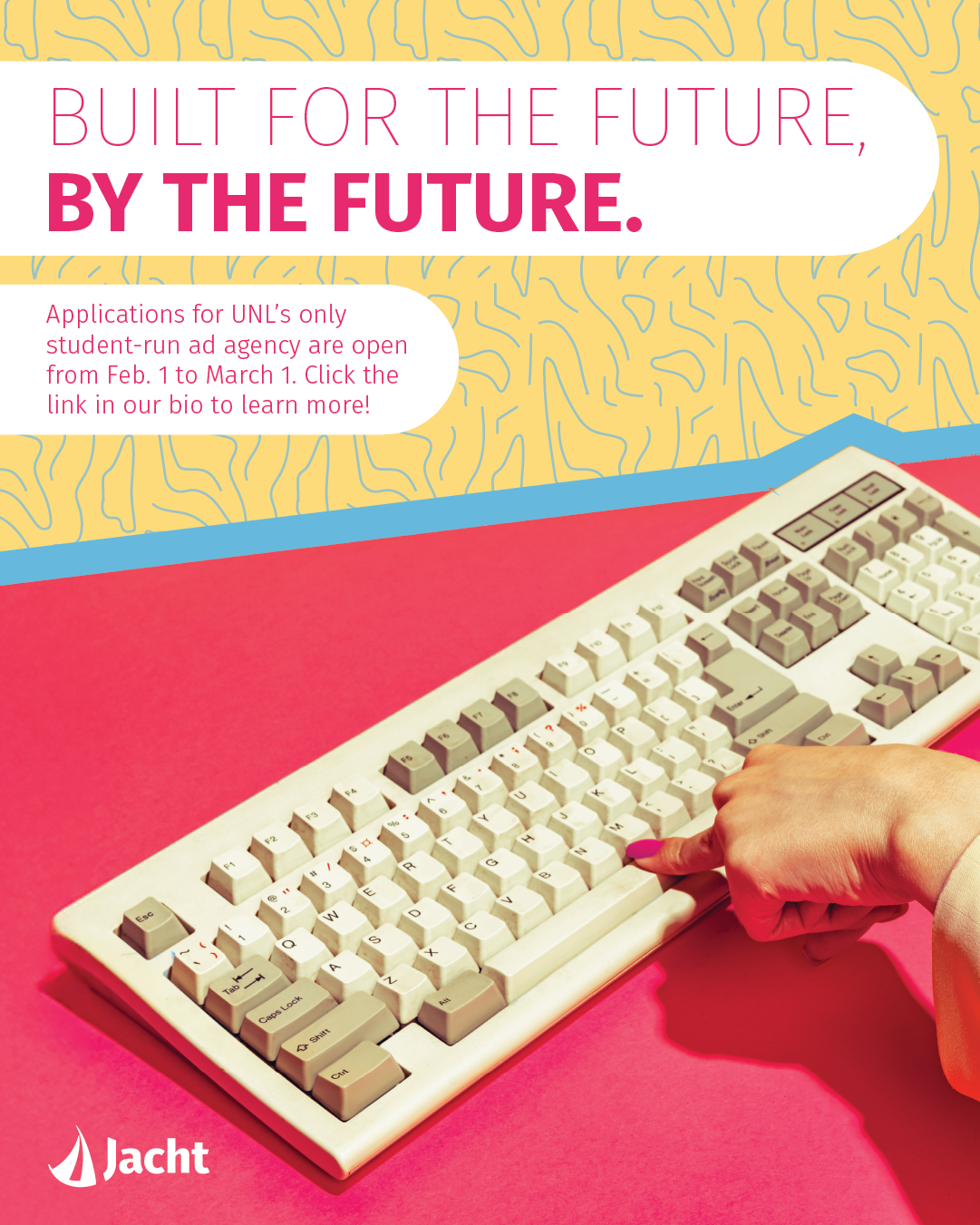
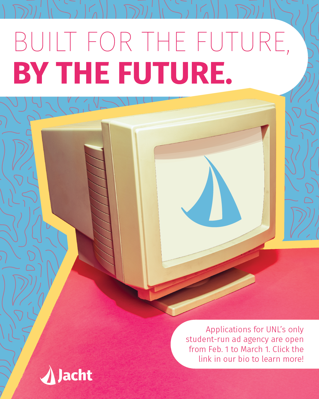
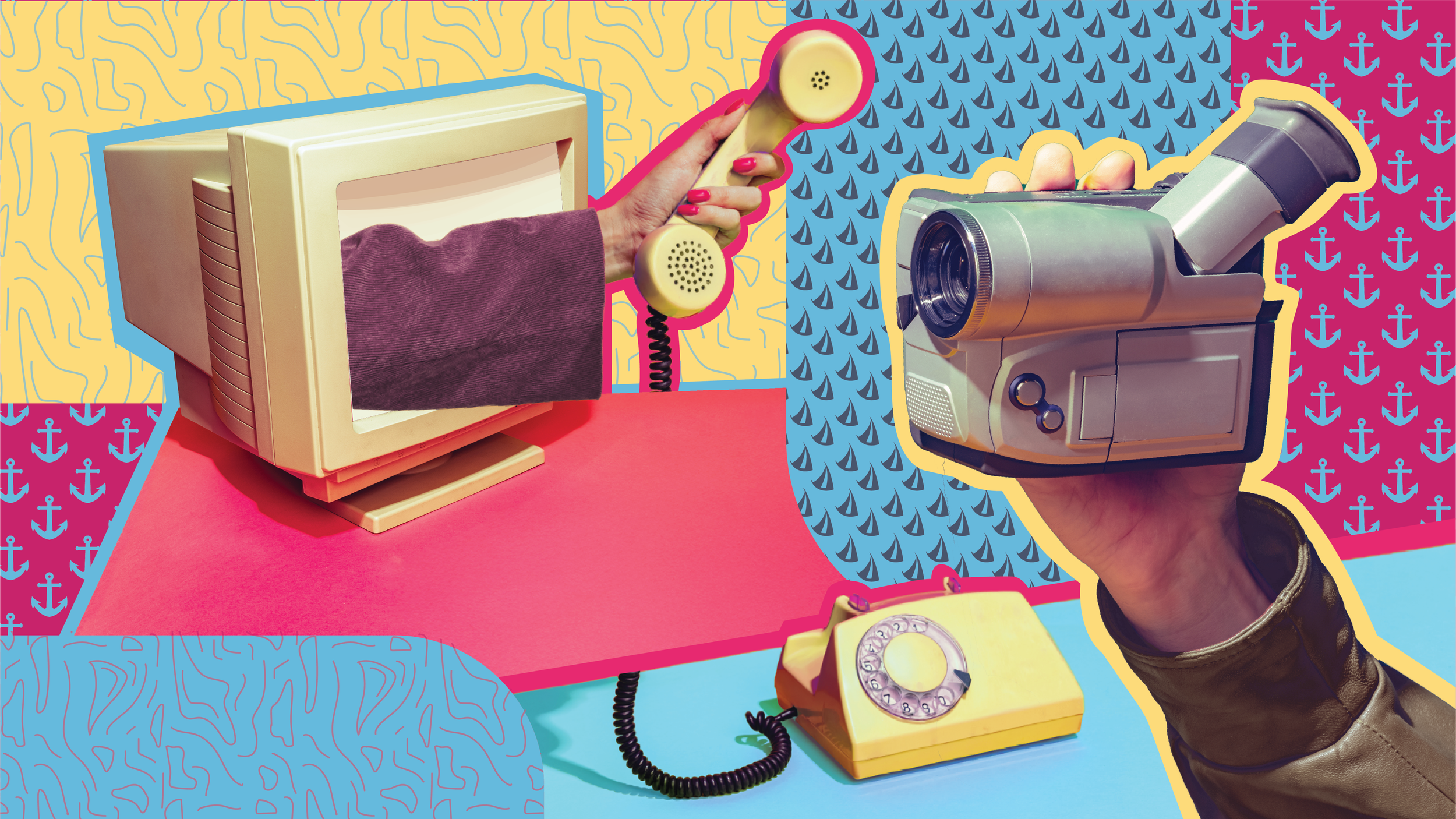
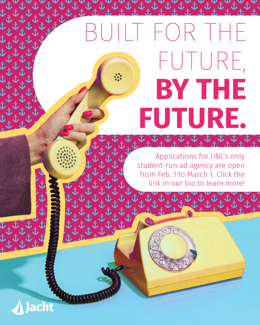
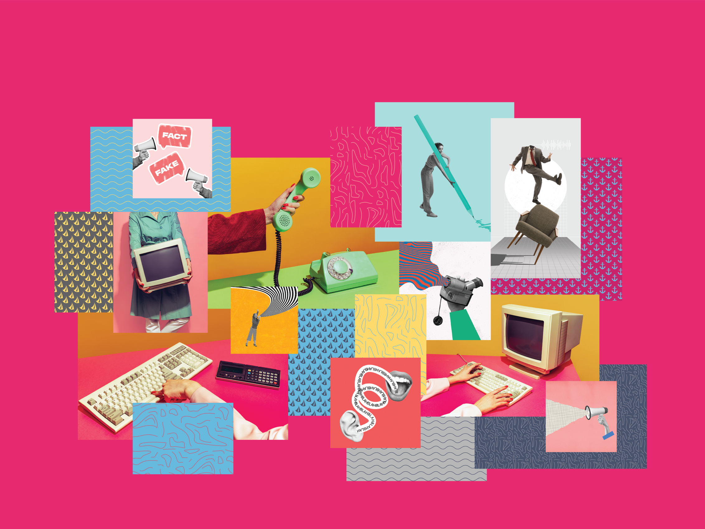
The semester before, I worked as a graphic designer on the internal team, so I was already familiar with our brand guide. One thing I noticed was that we tended to lean heavily on just a few of our brand colors- navy, light blue, white, and occasionally yellow. They’re professional and recognizable across campus as Jacht’s signature. But we actually have seven brand colors (including pink!!!) and over ten patterns that rarely get used.
The Vision
the execution
*
the execution *
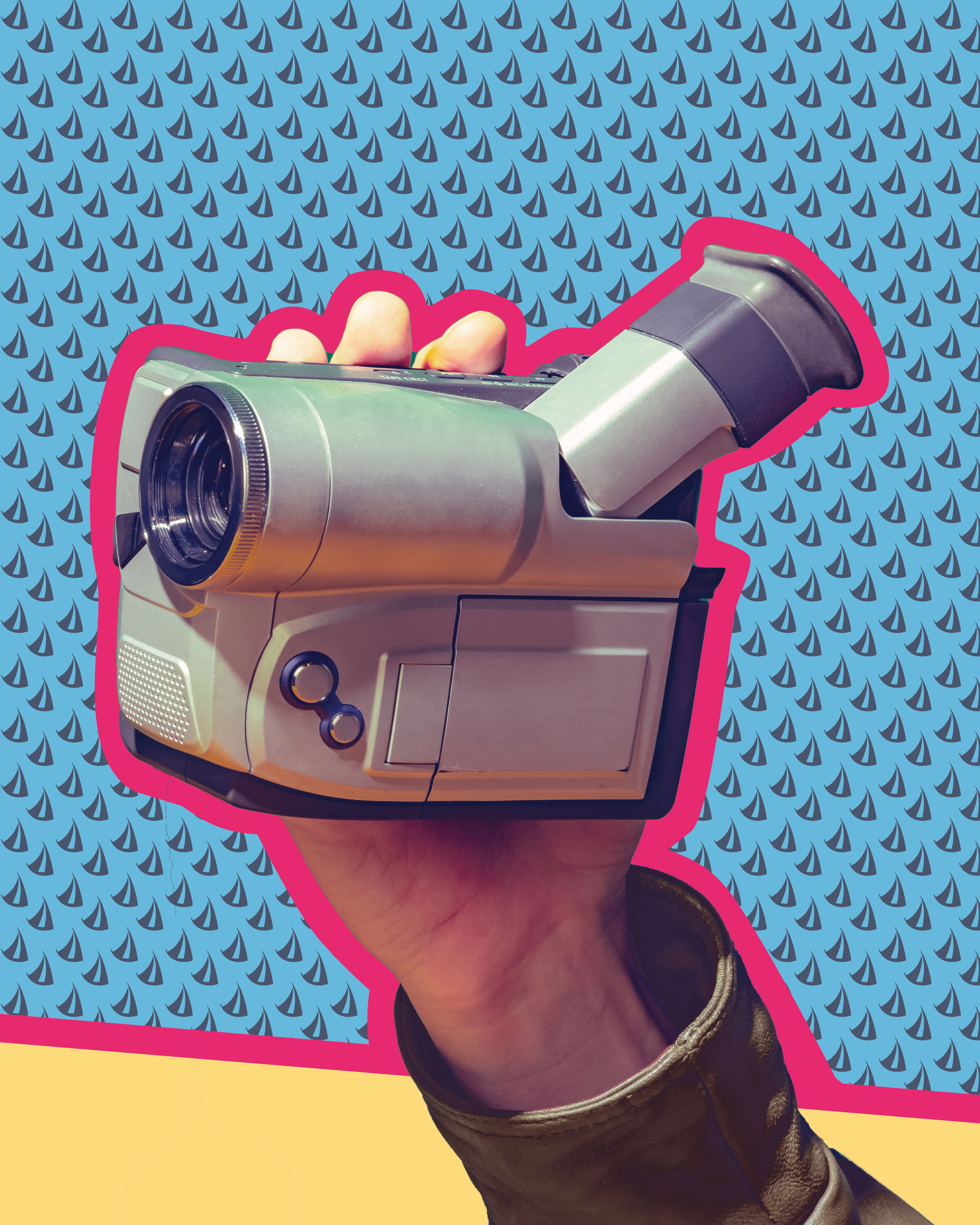
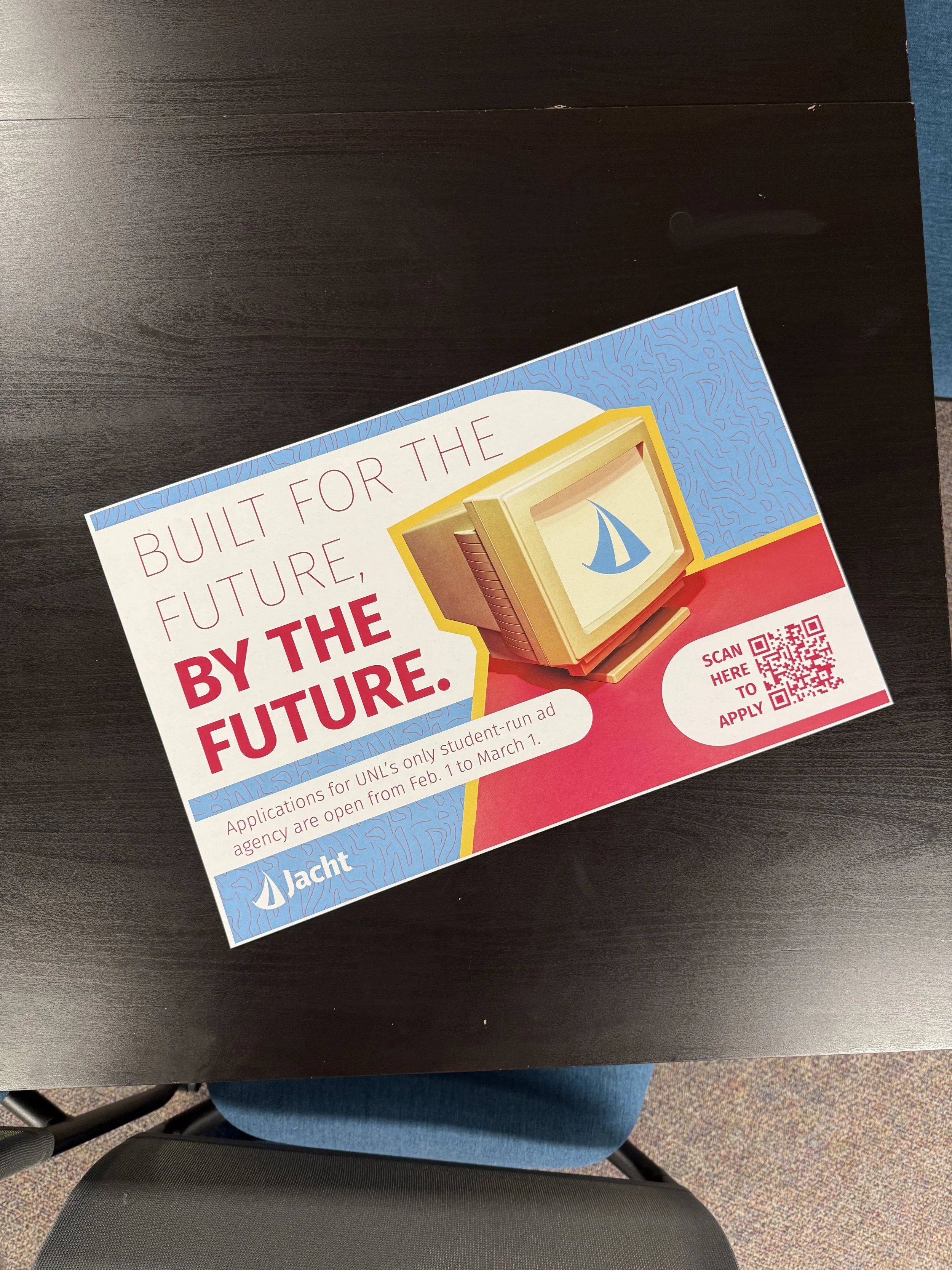
I made it my goal to bring those lesser-seen elements to life in our recruitment campaign. I incorporated more patterns and leaned into light blue, yellow, pink, and white to create an almost ’80s-inspired series of posters. I paired this visual direction with one of our mottos, “Built for the future, by the future,” but used it in a slightly ironic way. Seeing an early-2000s video camera next to the word future creates that subtle “wait… what?” moment that draws you in.